Product design · Design fiction · Mobile
Sen 選
A feed with an end — the anti-doomscroll feed, a finite, AI-curated serving of exactly what you chose to see, pulled across every platform.

Overview
| Project | Sen — a concept for an intentional, finite social feed |
| Type | Concept piece (design fiction — see note below) |
| Platform | Mobile |
| My role | Product Designer & Strategist |
| Tools | Claude Design, Claude Code, Figma |
| Timeline | 2-week concept sprint |
The name. 選 (Sen) means “to select / to choose.” It was chosen deliberately: every session in the app begins with the user making a choice, and the product’s entire argument is that a good feed is a curated one — someone (here, an agent acting for you) chose this, and it ends.
A note on scope — this is design fiction, honestly labeled. Today’s platforms deliberately wall off their feeds; no one exposes their personalized “For You” algorithm, and topic-search deep enough to fill a feed is closed on Instagram, TikTok, and Xiaohongshu. A fully cross-platform version can’t be built under current terms. Rather than pretend otherwise, Sen is presented as a vision piece: “platforms don’t allow this today — here is the experience if they did.” The technical constraints were mapped early and are treated as part of the story, not ignored.
The Problem / Challenge
The infinite scroll is not a law of nature. It is a design choice — one platforms made to maximize time-on-app.
The consequence is a familiar bind. People who genuinely want to consume intentionally still get pulled into mindless doomscrolling, and their attention is fragmented across a handful of apps that each want to keep them longer. There is nowhere to go and simply be intentional. Intention has no home.
The challenge: design a single feed that lets someone consume exactly what they came for — and then stop — without relying on willpower to fight an experience engineered to be un-stoppable.
Empathize
Who this is for
The primary user feels scattered and mindless now but wishes they were intentional. They are not a disciplined consumer looking for a marginal upgrade — they are someone caught in the habit who wants out of it. The arc that defines them is overwhelmed → in control.
The voice: empowerment, not comfort. This is a decision that shapes everything downstream. Sen is a tool, not a comfort blanket. It should make the user feel capable — like they’re holding the controls — never coddled, managed, or scolded.
Who this is NOT for
- The topic-obsessed deep-diver who lives inside one interest — they’re already served by going straight to the source.
- The “I want to quit social media entirely” crowd — they want no feed. Sen offers a better feed, which is the opposite promise.
Needs & pain points
- A home for intention. Wanting to be deliberate, but having no single place that supports it — only five apps that each undermine it.
- Control over what they see. Being fed rather than choosing; the feeling of consuming passively.
- Permission to stop. No natural endpoint; the scroll is engineered to hide its own bottom, so “just five more minutes” never arrives at an end.
- One place for two different jobs. Both going deep on a subject and keeping up with the people they care about currently require app-hopping.
Define
Problem statement
People who want to consume social media intentionally are trapped by feeds engineered to be endless and scattered across apps built to fragment their attention. They need a single place where they can choose what they see — and reach an end.
How Might We
- HMW let people consume intentionally without relying on willpower to fight the feed?
- HMW give an infinite feed an ending that feels empowering rather than restrictive?
- HMW let someone pull exactly the content they want from across fragmented platforms into one place?
- HMW make both “go deep on a topic” and “keep up with people” feel equally intentional?
Core user needs (the bar the design must clear)
- Let the user choose their focus — a topic, or the people they care about.
- Put them in control of the session’s shape — including when it ends.
- Provide a genuine stopping point, and make stopping feel good.
- Do all of this in a single, coherent home.
Ideate
The concept was arrived at through a sequence of deliberate forks. Each one sharpened the product by cutting something.
1. Aggregator vs. new app → new app. The original instinct was a pure aggregator that re-displays each platform’s already-personalized feed. But those algorithms and feeds are each platform’s crown jewels — they aren’t exposed. If Sen can’t inherit their personalization, then its own AI must become the algorithm, ranking content it sources itself. That reframe pushed the concept firmly toward a new app, with the AI as the curatorial brain.
2. Convenience-led vs. control-led → control-led. “One place for all my apps” is a convenience play — and a crowded graveyard, because mild convenience never overcomes switching costs. More importantly, convenience-led design means frictionless infinite scroll, which is structurally a better doomscroll machine. Leading with control — a taste the user steers — is both more differentiated and the only framing that resolves, rather than worsens, the mindless-scrolling problem. Convenience becomes a by-product, not the pitch.
3. Buildable-and-partial vs. vision concept → vision concept. Given the platform walls, one option was to ship a real but partial product (the reachable sources only). The other was to design the full cross-platform dream as an honest concept piece. The concept route was chosen to preserve the complete idea — with the constraint-mapping folded in as evidence of rigor rather than hidden.
4. Consistent feed vs. context-adaptive feed → consistent. Sen is meant to be the user’s default scroll — reached in all three moments they’d normally open social media (an intentional sit-down, dead time, and the late-night bed-scroll). A feed that shifted mode by context was considered, but a single, coherent experience is the bolder position and a cleaner thesis: doomscrolling simply isn’t a mode Sen has.
5. What stops the scroll → a feed with an end. This is the centerpiece decision. Several mechanisms were weighed — natural pauses, up-front session intent alone — but the strongest is the most radical: the feed is finite. The scroll ends because there is nothing after it. This kills doomscrolling structurally rather than through willpower, and it turns the app’s thesis into a mechanism instead of a promise.
6. Who sets the boundary → the user, with a sensible default. Imposing a limit would contradict the empowerment voice. Instead, the user defines the boundary — “give me the top 30” or “I want 30 minutes” — with a sensible default for the majority who never change defaults. The stopping point becomes another thing the user controls, keeping the product consistent all the way down.
Deliberately cut for v1: in-app posting / cross-posting (complex, undifferentiated, and off-thesis) and a portable taste-memory (powerful, but a later layer). Both are on the roadmap, not in the core story.
Prototype
The core loop
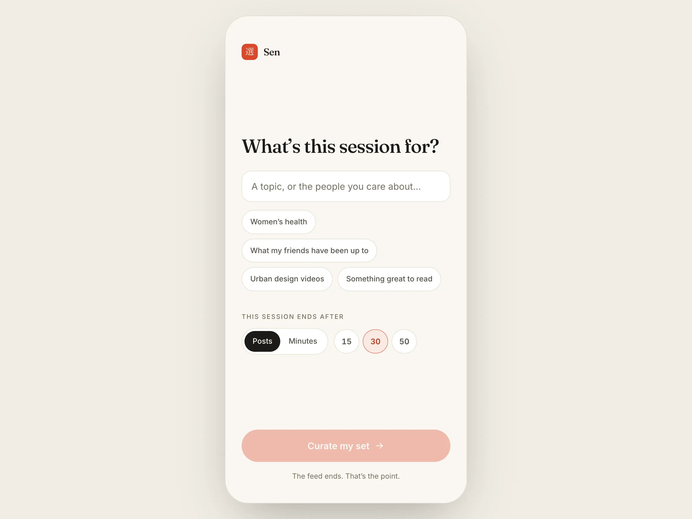
- Set intent. The user opens Sen and states what they want: a topic (“women’s health”) or people (“what my friends have been up to”), plus a boundary (“top 30” / “30 min”) — or accepts the default.
- The agent curates. The AI assembles a finite set — drawn across platforms — to fit that intent and that boundary.
- It ends. The session concludes deliberately, at the point the user defined. The ending is the app’s signature moment.
The Intent screen (the start). Sen’s most important reframe lives here: you open the app into a choice, not into a feed. Instead of being dumped into an endless stream, the user first says what this sitting is for. This is the empowerment voice made literal.

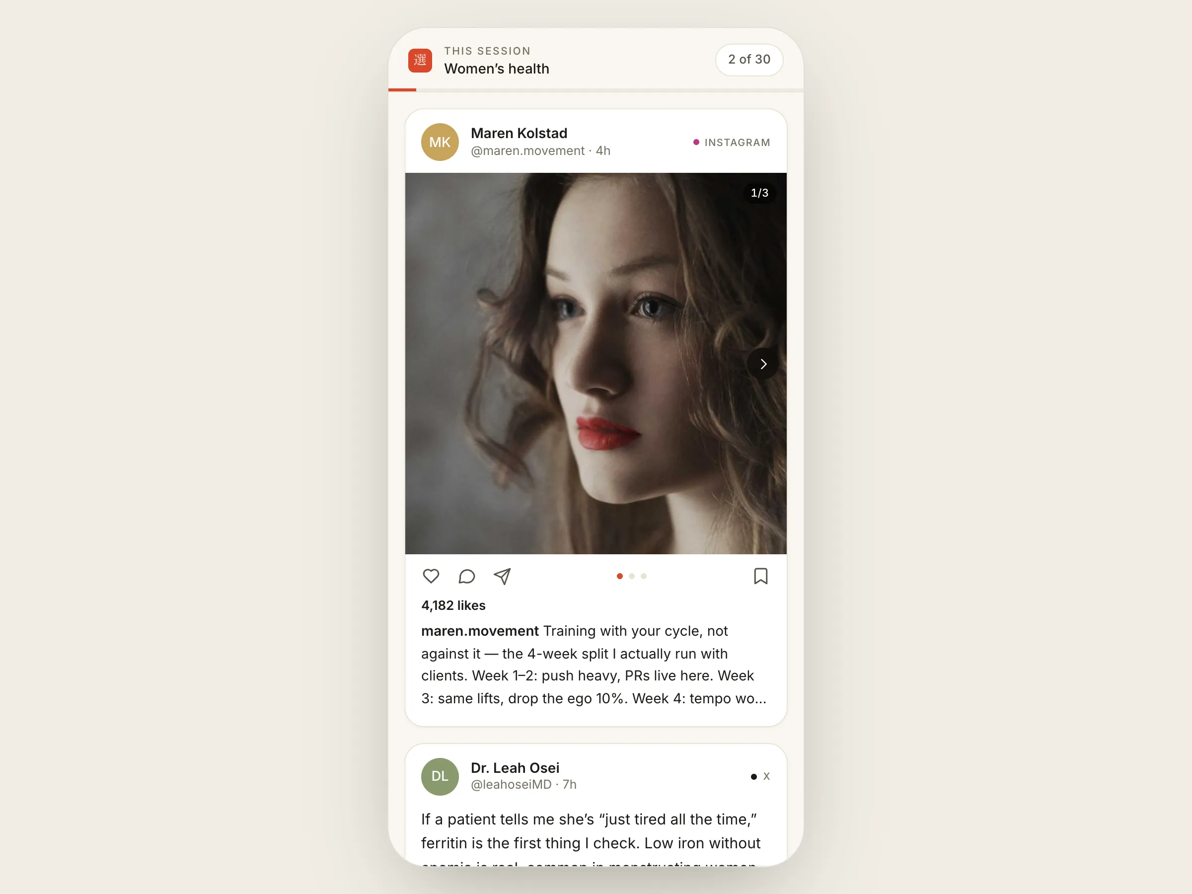
The finite feed. A single scroll of mixed-format content assembled for the session — with a visible sense of progress toward the end. Because the feed is finite, the user can always see how much remains. (In an infinite feed, hiding the bottom is the whole trick; Sen does the opposite on purpose.)

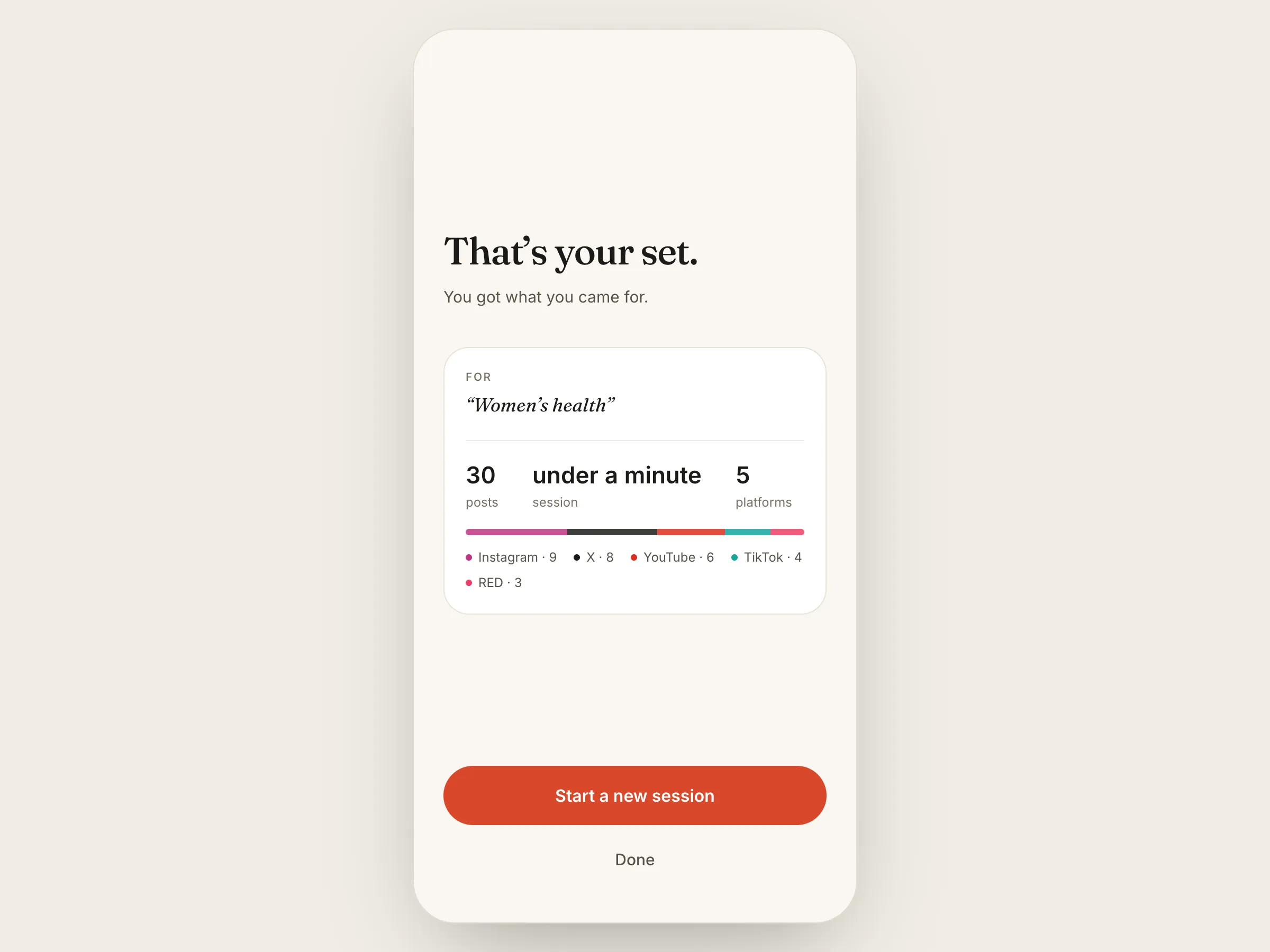
The ending. When the set is complete, the user reaches a designed, affirming close — “that’s your set”, not “you’ve been cut off.” From here they can deliberately begin another intentional session or leave satisfied. This screen carries the entire emotional argument of the product.

Information architecture — a shallow app on purpose. Sen’s home is not a feed; it’s the act of choosing one. The feed is a session — a thing you enter and finish — rather than a place you live inside. The whole structure resists the endless nesting and “always more” that other feeds are built on. A single unified intent input handles both jobs (topic and people), so “keeping up” and “going deep” share one front door.
Design decisions, tied to user needs
| Decision | Serves the need for… |
|---|---|
| Open into intent-setting, not a feed | Choosing your focus; feeling in control |
| Visible progress toward a known end | A genuine stopping point (finitude made visible is the anti-doomscroll mechanism) |
| User-set boundary + sensible default | Empowerment — capable, not coddled |
| An affirming ending, not a cut-off | Permission to stop, without being scolded |
| One input for topic or people | A single home for two jobs |
| One consistent experience, no modes | Clarity; the “no doomscroll, ever” promise |
Honestly flagged as open (design rationale, not settled fact). Several decisions were scoped to the prototype phase and remain genuinely open: what precisely defines “the end” (a count, a time budget, or the agent’s judgment of when the good content is spent); exactly what the ending screen offers; the value of the default boundary (which effectively is the product for most users and deserves real research); and the interaction puzzle of how radically different formats — a 12-minute video, a text post, a photo carousel — coexist in one coherent scroll. These are named rather than papered over.
Test
Because Sen is a concept, there is no shipped data — the section below is how it should be validated, framed as a plan rather than a result.
What to validate
- Does starting with intent feel natural, or like friction? The Intent screen asks the user to do work before they get their reward. Usability testing should confirm this reads as empowering rather than as a chore standing between them and content.
- Does a finite feed satisfy — or frustrate? The central bet. Do people reach the end feeling done and content, or annoyed and reaching for more? This is the single most important thing to test, ideally against the ending screen specifically.
- Does it change behavior over time? A longitudinal diary study: over weeks, does Sen actually displace mindless scrolling, or do users drift back to their old apps once novelty fades?
- What default earns its keep? Since most users never change defaults, different default boundaries should be compared directly.
Metrics to watch — and the ones to deliberately ignore
The important move here is refusing the industry’s default scorecard. Time-on-app and sessions-per-day are the wrong North Star — for Sen, those numbers going up would signal failure, not success, because they’re the doomscroll metrics the product exists to reject. Instead:
- Session completion — did users reach the end they defined for themselves?
- Post-session satisfaction — “did you get what you came for?”
- Felt control — a survey measure of whether users feel they steered the experience.
- Regret — do users feel good about the time afterward, versus the guilt that follows a doomscroll? (Low regret is the real win condition.)
- Return intent — do users come back and deliberately set a new session, rather than reopening on autopilot?
- Displacement — reduced time in the other apps, as a signal Sen is truly becoming the default.
Outcome & Reflection
Expected impact (stated as hypothesis). If the core bet holds, Sen’s users consume less but feel more satisfied — they get what they came for, feel in control of it, and stop without guilt. Intention finally has a home. This is a design hypothesis, not a measured outcome, and the Test plan above is how it would be proven or disproven.
What I learned. The most valuable lesson was that the project got sharper by confronting its hardest constraint rather than avoiding it. What began as a broad “everything in one feed” aggregator kept colliding with the reality that platforms won’t expose their feeds — and each collision forced a better decision, until the concept resolved into something more original than the starting point: not “all your apps in one place,” but an infinite feed that structurally can’t become a doomscroll. The constraint became the concept.
A second insight was separating two things that had been fused: making the what intentional (choosing a topic or people) and controlling the how long (the session boundary) are different problems. Solving only the first still leaves an endless feed; the finite-feed decision was what closed the gap.
What I’d do next.
- Portable taste-memory — a user-owned taste profile (in the spirit of an AI’s memory of you) that persists and improves across sessions. The most exciting next layer, deliberately held out of v1.
- The format-collision problem — design how genuinely different content types share one coherent scroll.
- The default boundary — research it properly, given its outsized influence on real behavior.
- Validate that finitude satisfies — run the ending test early, because the whole thesis rests on it.